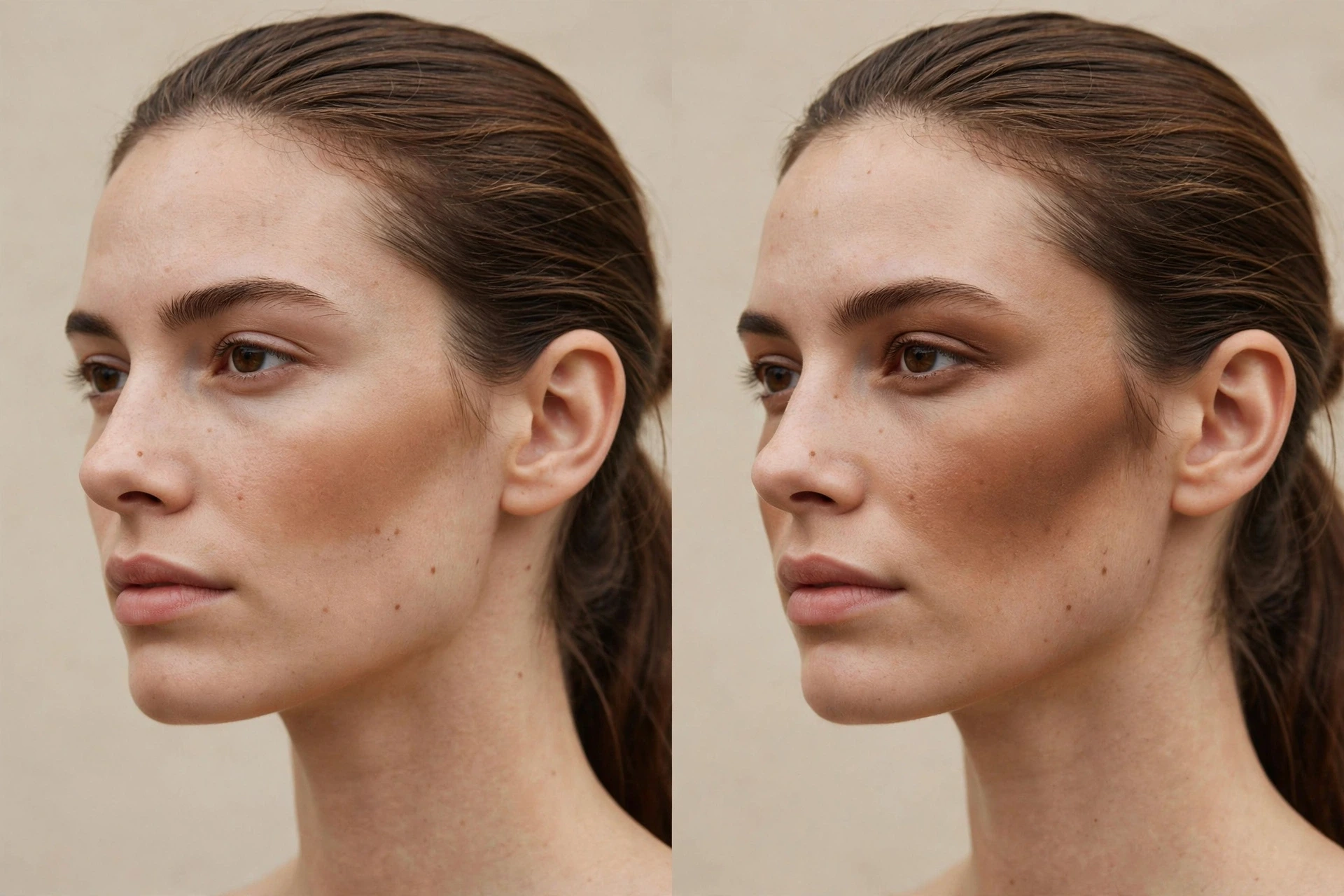
You applied your bronzer expecting warmth, and instead of a believable glow you got a dull, dirty-looking cast sitting on your cheeks. The foundation underneath looks fine. The blush is going on later. It’s the bronzer itself — brownish, flat, a bit grey in places — that reads wrong in the mirror.
“My bronzer looks muddy” sounds like one problem. It isn’t — and the interesting part, if you go looking for answers, is how much of the standard advice rests on thinner evidence than it pretends to. This guide separates what named professionals and brand education actually support from what beauty writing repeats out of habit. Where the evidence runs out, we’ll say so rather than fill the gap with a mechanism nobody has demonstrated for bronzer on skin.
This guide works the way this publication always works: what it looks like → what to rule out first → how to check it with one controlled change at a time → what to change. One honest statement up front: these checks suggest; they don’t deliver a definitive diagnosis. Makeup read in a mirror depends on light, base, and product, and no at-home comparison controls all of that.
Scope note, once: This guide is about a bronzer that looks muddy in the cheek zone, at the moment you put it on, while the foundation underneath otherwise looks like itself. If your whole base looks grey or ashy before bronzer goes on — grey from the first stripe, not just where the bronzer sits — that is a different problem: start with why foundation looks ashy instead. If your makeup looks right at application and then darkens or oranges over hours, that is a wear-change problem, not this one. This article stays with the bronzer, on the cheeks, at application.
The short answer
A muddy-looking bronzer usually resolves into something you can check in order:
- Too much product, or a shade that is too deep — the two overlap so completely in the mirror that they form one gate, not two. Rule out the dose before you replace the shade.
- A base/product-format mismatch — powder grabbed by an unset base, or cream sitting on top of powder. This tends to read patchy and dirty rather than like a uniform dull cast.
- An application pattern that amplifies a borderline result — all-over dusting or circular buffing that spreads colour where it reads heavy. Pattern makes problems worse; it rarely creates a colour problem by itself.
- A colour-direction mismatch — real, but narrower than the internet says, and it comes last. Two attributed observations survive scrutiny; the famous undertone-matching rule does not.
The working order: rule out dose → then depth → then base and format → then pattern → and only then colour. Work the gates in order before replacing the shade.
Start Here: Name the Look Before You Touch the Brush
Answer from the mirror. This publication uses three working words for what “muddy” tends to look like at application. They are our own working descriptions — a routing device, not diagnoses, and not a vocabulary any expert body has standardized:
- A grey, ashy veil. The bronzer zone looks dulled and grey-leaning rather than warm. Foundation elsewhere reads normal.
- Dark and heavy. The colour reads too strong, too deep, sitting on the cheek like a stripe or a smudge rather than a glow.
- Patchy and dirty at the edges. The failure is uneven — darker grabs, broken edges, a texture problem more than a colour problem.
The look tells you which gate deserves the most attention — a patchy failure makes the base/format gate likely; a dark, heavy one makes dose and depth likely. It does not let you skip the cheap gates. A grey veil, in particular, is not permission to jump straight to colour theories: heavy or uneven application can dull even a well-chosen shade. Work the gates in order.
One boundary before the gates, because this is where the grey-veil readers belong elsewhere: if the grey or ashy cast covers your whole face — there from the first stripe of foundation, before any bronzer — that is the foundation problem this site covers separately. Bronzer localized on normally-reading skin is this article. Whole-face grey is not.
Gate 1: Dose and Depth — Too Much and Too Deep Look Alike
This is the core gate, and it starts with an admission the usual advice skips: a heavy layer of the right shade and a normal layer of a too-deep shade can look the same in the mirror. Both read dark, flat, and dirty-edged. Nothing about the failed application tells you which one you’re looking at. That is why this gate changes the amount before it judges the shade.
The depth side is genuinely supported. Bobbi Brown’s version of the rule is blunt: “If the bronzer looks muddy on skin, the shade is too dark.” Trinny London’s pro makeup artist Katie Levy gives the same direction: “Go too dark, and you run the risk of your bronzer looking muddy.” So “too deep” is a real way to get a muddy read — not merely a harsh one. But the amount side is just as documented: GlamGeek’s powder-bronzer guidance names “too much product on the brush” first among its muddy causes. Whether a given failure is depth or dose cannot be settled by looking harder. It is settled by the check below.

The first check: a thin-versus-heavy comparison
Before you change shades, change only the amount.
Apply your usual built-up application on one cheek and a single sheer layer of the same bronzer on the other — same placement, same tool, same base underneath, judged in the same light (natural light if you can get it; every credible version of shade judgement repeats that condition). Use a fresh brush load for each side, so one side doesn’t quietly get more product from a fuller brush.
- What it changes: the total amount of product.
- What it holds constant: the product and shade, the placement, the base, the tool.
- What a result means: if the sheer side reads noticeably cleaner than the heavy side, dose was contributing — that supports reducing how much you load and apply before you conclude anything about the shade. This is the same “build gradually” doctrine professionals repeat for every format, and heavy layering is explicitly tied to “a muddy finish” in application guidance.
- What it does not prove: that the shade is right. A too-deep shade sheered down can look acceptable while still being the wrong depth at full strength. It also doesn’t exclude base or pattern problems — and it has one honest flaw: people unconsciously blend the heavier side harder, so blending effort sneaks into the comparison. Keep the blending as similar as you can and treat the result as a steer, not a verdict.
If the sheer side reads clean, your fix lives in loading discipline, and it is mostly a powder story: a dense or stiff brush deposits more product than the skin needs, while a softer brush sheers it out (makeup artist Eddie Duyos makes exactly this point about brush density). Tap off excess before first contact; celebrity makeup artist Lasalle Lee’s version is to swirl the brush on a tissue first to remove excess pigment. None of this requires a new product.
If the thin layer still fails: the depth screen
Only when the sheer layer of your current bronzer still reads muddy do you judge depth — and you judge it with a screen, not with the failed application.
Swatch the bronzer at the jawline in natural light. Understand what the jawline is here: a screening location — the strip where face meets neck, useful for comparing a shade against your own skin. It is not where bronzer is worn, and this is not a recommendation to apply bronzer there. Bronzer lives on the cheek.
Two screening rules, both different from foundation-matching:
- Depth is expected. Professional guidance repeatedly lands on a working target of one to two shades deeper than your natural skin tone (Lee; brand educator Jason Hoffman gives depth-keyed ranges with the hedge “everyone is different”). A bronzer that “disappears” into your skin the way a foundation should is too light to do bronzer’s job — disappearing is the wrong passing rule here.
- The read should be harmonious warmth. The candidate shade should add warmth at that depth without reading ashy or orange at the jawline. Ashy at the screen points one way (last gate); orange points another; both are colour-direction observations handled later — the screen’s job at this gate is only to confirm whether your current shade is plausibly too deep.
What the screen does not prove: why a full application failed. A jawline stripe exercises none of the amount, placement, base-state, or blending variables that a real application involves. It screens a shade; it does not diagnose a failure.
Gate 2: Base and Format — Powder Behaves Differently From Cream
If dose didn’t explain it, the next suspect is the meeting point between your bronzer and what’s underneath it — and here the answer depends on which format you’re holding. Powder, cream, and liquid bronzers do not fail the same way, and importing powder logic into a cream problem (or the reverse) is how people chase the wrong fix.
Powder bronzer
Powder needs the base underneath it settled. Brand education from Jane Iredale is direct: if you’re layering powder bronzer over foundation, apply a dusting of powder first “to prevent an uneven application.” Makeup artist Emma O’Byrne warns the other side of the same coin: let foundation or tinted moisturiser settle before powder bronzer goes on, because applied over unsettled or dry areas it can “stick to any dry areas, turn darker and look patchy.” Professional routines converge on the same order — set or settle the base, then bronze.
Powder’s control point is before contact: the load on the brush is the decision (tap off, tissue-swirl, build in light layers), because once a heavy powder layer is down, the practice guidance cited here offers no reliable way to sheer it back — the load decision has to happen before contact.
One honest complication: sources disagree about powder on dry skin. Jane Iredale says its powder blends easily even on drier skin; O’Byrne warns powder grabs on dry areas. Both are plausible — for their products. Treat dry-skin behaviour as a property of your specific bronzer, not a law of the powder format.
Cream and liquid bronzer
Cream has one hard ordering rule, stated as bluntly as anything in this article. Space NK’s bronzer education concludes: “once powder has been added, your cream bronzer will need to be dismissed — cream on powder is a recipe for patchiness.” Cream bronzer belongs on a powder-free base, over liquid complexion products (Space NK’s ordering rule); liquid is grouped with cream in this article — no liquid-specific order source was found, so the same caution is this guide’s grouping, not a sourced rule. Powder, if it comes, comes after. The same guidance warns against streakiness when cream bronzer meets incompatible layers beneath it.
Cream’s control point is the opposite of powder’s: during and after contact. A dense brush or damp sponge used in a stippling (pressing) motion is the cited technique for this format; a damp sponge sheers cream out to a softer finish; and makeup artist Jamie Genevieve notes you can tone an over-application down with the leftover foundation on your brush or sponge. Cream-over-powder problems can’t be fixed by sheering harder, though — the order is the fix.
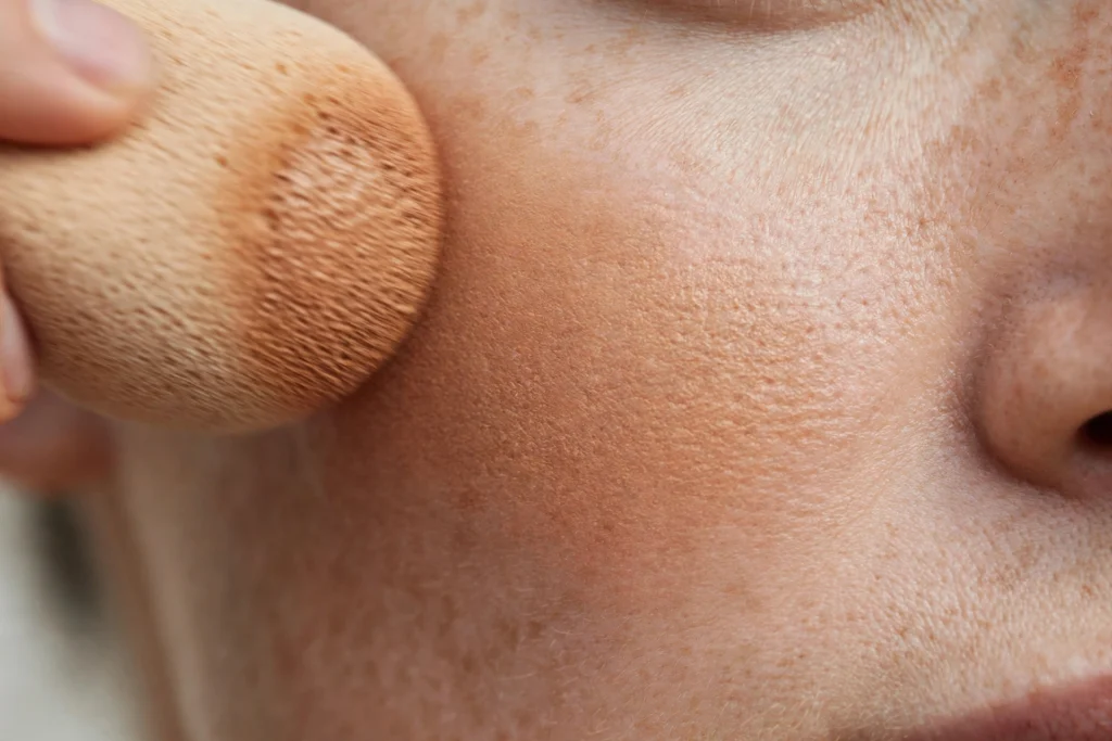
Liquid bronzer rides with cream in this article deliberately: in the guidance we could open, it is handled with the same sheer-out tools (sponge, stippling, residual foundation) — but no source credibly isolates a liquid-specific muddy failure distinct from ordinary over-application. We won’t invent one.
Patchy is not the same failure as muddy
Worth separating plainly, because the two get filed under one word: the dull, dirty-looking veil this article is about is a colour-and-clarity read. Patchiness — darker grabs, broken edges, uneven payoff — is a distribution failure, and it is what the base/format mismatches above actually produce. Users reasonably call both “muddy.” If your bronzer’s failure is primarily patchy, this gate is your most likely home; if it’s a uniform dull veil over evenly-applied product, keep moving in order.
Gate 3: Application Pattern — the Amplifier
Nothing in this gate changes the colour you’re wearing. Pattern changes how much of it the eye reads, and where — which is why it can turn a borderline dose or depth problem into an obvious failure, and why fixing pattern alone never fixes a colour problem. Read this gate as an amplifier, not a cause.
The pattern failures with direct professional language behind them are distributional. Lasalle Lee names the first: “applying bronzer like setting powder and dusting it all over the face, which flattens the features and makes the complexion look dirty.” The second is buffing style: circular motions all over the cheeks “can result in a patchy or muddy appearance” (Lee again). Sweeping into the hairline and buffing inward is his prescribed alternative.
The contour look-alike. If your bronzer is living in the hollow of the cheek — the shadow zone — you may be looking at warm colour doing a shadow’s job. Bronzer is the “sunshine” product and contour the “shadow” product (Lee’s framing, and the standard professional distinction). Warmth placed where the eye expects shadow tends to read shadowy and heavy rather than sunkissed. That is a placement identity problem, and it ends here: this article doesn’t teach contour placement or adjudicate bronzer-versus-contour technique; it only flags that a shadow-zone bronzer can look like the muddy failure while actually being a wrong-zone application.
Where height actually matters. Low placement has its own literature, and it mostly does not say “muddy.” Makeup artist Judi Gabbay warns against applying bronzer “too low under cheekbones” because it “can visually drag down the face instead of creating a lifted look”; pro artist Tamara Boyd says much the same — low product “pulls the face down.” So height by itself produces dragged and heavy, not a colour shift. (One powder guide does list low placement among its muddy causes; the stronger named-artist sources reframe it as dragging. We go with the stronger sources.) Height still belongs in this gate as an amplifier: product that is both low and built up can read denser in the zone where the eye reads shadow — an inference from the density point above, offered as one, not a sourced rule.
If you suspect placement is contributing, the honest check is a higher-placement comparison: same bronzer, same amount as your normal application, placed higher on the cheekbone instead of your usual spot. What it changes: placement height. What it should hold constant: product, amount, tool, base. What a cleaner read means: placement was contributing — never that it was the sole cause, because the same amount squeezed into a higher, narrower band lands denser, so density sneaks in as a second variable. Treat this as the weakest of this article’s checks: a contribution indicator only.
Gate 4: Colour Mismatch — Read This Last
Here is where the undertone conversation lives — deliberately last, deliberately small, because what survives evidence-checking about undertone and bronzer is much less than what gets repeated about it.
First, what does not survive: the popular matching rule — warm bronzer for warm skin, cool bronzer for cool skin, stated as a law. In the sources we opened, that rule appears unhedged only in low-tier editorial; real professional guidance is hedged and keyed to depth (“everyone is different, but in general…”). No tested evidence stands behind it as a universal rule, so this guide doesn’t repeat it as one. Also not supported, by any credible source we could find: the claim that a cool bronzer makes warm skin look muddy. Zero sources. It doesn’t appear here as a possibility.
What does survive is two narrow, attributed observations — symptom tokens, not laws:
- Too cool can read grey or ashy. Makeup artist Jennifer Oliver, on shade selection generally: “Too cool a shade can look grey and ashy, and it can make your skin look lifeless” — and she extends it explicitly: “that goes for your blusher and bronzer, too.” If your failure is the grey-veil look and it survived the dose gate, the base fork, and the pattern gate, a shade that leans too cool for you is a legitimate last suspect. This is one named artist’s observation, quoted as hers — not a rule that cool equals grey on everyone.
- Too warm can read orange or red — on lighter skin. Rose Inc’s bronzer education, from makeup artist Jason Hoffman: “For lighter skin, try to avoid going too warm as it can look orange or red.” Note the scope: lighter skin tones, from a guide whose advice is explicitly hedged and depth-keyed. We don’t extend it past that scope.
One narrower narrative sits between them: an editor account at Who What Wear observes that warm, golden, or terracotta bronzers “can read orange — and, in one editor’s account, as muddy — on cool complexions.” That’s a single editor’s wording with “orange” and “muddy” offered together and undefined, no named artist attached to the sentence. It’s the only defensible form of the “mismatched undertone makes mud” story we found, and it’s presented here at exactly that strength.
So what do you do with colour? Nothing global — you screen. Close with the same jawline screen from Gate 1: natural light, candidate shade at the jawline — the screening target is a shade sitting visibly one to two shades deeper — and the pass condition is that it reads as harmonious warmth on your skin rather than ashy or orange. One limit of the screen, stated plainly: a jawline stripe tests the shade against your skin, not over the foundation you actually wear — a passing screen with a still-grey sheer layer over your base means the colour question stays open, not that colour is cleared. If your current bronzer fails the screen and its sheer layer failed the dose check, a different shade is a supported next step. If it passes the screen, colour was probably never your problem, and the earlier gates deserve a second pass.
And the recurring boundary, because grey-veil readers drift here: a grey cast that covers your whole face from the first application is foundation mismatch, not bronzer colour. That’s the neighbouring guide’s territory, linked below.
The Checks in One Place
Every check in this guide, in the order the gates use them. Each changes one thing; each states what it cannot show.
| Check | What it changes | What stays the same | What a cleaner result means | What it does NOT prove |
|---|---|---|---|---|
| Thin-vs-heavy comparison (Gate 1) | Total amount: sheer layer vs your usual build | Product, shade, placement, base, tool | The result is amount-sensitive — dose was contributing; reduce load before judging the shade | That the shade is correct or cleared (a too-deep shade sheered down can read cleaner too); that base or pattern play no part |
| Jawline depth screen (Gates 1 & 4) | The shade being judged (current vs candidate) | Your skin, natural light, screening location | The shade is plausibly too deep, or plausibly reads ashy/orange on you | Why a full application failed (it exercises no application variables) |
| Higher-placement comparison (Gate 3) | Placement height only | Product, amount, tool, base | Placement was contributing to the heavy/dirty read | Sole-cause proof — density co-varies when placement changes |
The thin-versus-heavy comparison is the check that comes closest to isolating its variable — the amount. Its result is amount-sensitive, never shade-clearing: a too-deep shade sheered down can read cleaner too. The other checks support “contributing” and “plausible” — and the article’s claims never ask them for more.
When the Problem Belongs to Another Guide
- Whole face grey or ashy from the first stripe of foundation — foundation depth/undertone/opacity, not bronzer. Our guide on why foundation looks ashy owns that diagnosis, including its own boundary rules.
- Makeup fine at application, darker or oranger by evening — a wear-change problem with your base, including bronzer that seems to deepen over the day: why foundation turns orange owns it.
- Cheek colour that vanishes by midday — the opposite failure from this one, and a blush topic besides: why blush disappears so fast.
- Bronzer (or the makeup under it) that streaked or went patchy the moment you sprayed setting spray over it — that’s the spray step failing, not the bronzer: why is my setting spray not working.
FAQ
Why does my bronzer look grey instead of warm?
Work in gate order before concluding it’s the colour. A heavy or uneven application can dull even a suitable shade, so run the thin-versus-heavy comparison first. If the sheer layer still reads grey on normally-reading foundation, one attributed possibility remains: makeup artist Jennifer Oliver observes that too cool a shade “can look grey and ashy” — an observation about that shade on that skin, not a rule. Note the screen’s limit here: a jawline stripe tests the shade on skin, not over your worn foundation — if the screen passes and a sheer layer still reads grey over your base, the colour question stays open; it is not cleared. And if the grey covers your whole face from the first stripe of foundation, it’s not the bronzer at all; that’s foundation mismatch.
How can I tell whether it’s too much product or the wrong shade?
You can’t — from the failed application itself. Too much of the right shade and a normal amount of a too-deep shade produce the same dark, heavy, dirty-edged read. Change only the amount: a sheer layer of the same bronzer in the same place. If sheer reads clean, dose was contributing. If sheer still fails, screen the shade at the jawline in natural light, remembering the screening target in the cited professional guidance — bronzer sitting visibly one to two shades deeper; “disappears” is the foundation criterion and the wrong one here.
Can where I put bronzer make it look muddy?
Placement amplifies; it doesn’t change colour. All-over dusting and circular buffing over the cheeks are the pattern failures professionals attach dirty and muddy language to, and bronzer worked into the hollow reads shadowy because it’s doing a shadow’s job in warm colour. Height alone is different: low placement reads dragged and heavy, per the named artists who address it — a shape outcome, not a muddy one. Fix pattern to un-amplify a problem; don’t expect it to fix colour.
Why does my cream bronzer look patchy?
Most credibly: order. Space NK’s ordering rule puts cream bronzer on a powder-free base, over liquid complexion products — it calls cream over powder “a recipe for patchiness.” Patchiness is a distribution failure — uneven payoff, darker grabs — which many people reasonably file under “muddy,” but its fix is ordering and base compatibility, not shade. If your base was already powder-free, the next suspect is technique, not shade: sheer cream out with a damp sponge in stippling motions, or tone it down with residual foundation on your brush; powder over the top, if any, comes after.
My bronzer looks fine in the pan and muddy on my face. Is it my undertone?
Maybe — but it’s the last place to look, not the first, and the evidence is thinner than the confidence of most undertone content. No universal warm-matches-warm, cool-matches-cool rule survived checking; the claims that did survive are two attributed observations (too cool can read grey and ashy; too warm can read orange or red on lighter skin). Run the dose comparison and the base/format check first, then screen shades at the jawline in natural light. If the sheer layer of a screen-passing shade still reads muddy, the earlier gates are likelier than a colour verdict.
The bronzer looks good in the morning and dirty by evening. Is that covered here?
No — and deliberately. This article scopes to muddiness you can see at application, on a base that’s otherwise behaving. Colour that develops, deepens, or oranges over hours is a wear-change problem with the base product, and it has its own guide on this site. That exclusion is deliberate: this guide does not attempt an in-article fix for evening colour change, because its cause sits with the base product’s wear, not with how the bronzer was put on.
Sources
Evidence tiers labeled honestly. Professional observations are quoted as observations, not verified mechanisms.
- Bobbi Brown — bronzer education (brand-founder education, republished via Ageless Radiance Club). “If the bronzer looks muddy on skin, the shade is too dark.” Basis for the too-deep shade token. (Brand-founder education.)
- Trinny London — how to find the right bronzer shade (Katie Levy, Pro Makeup Artist). “Go too dark, and you run the risk of your bronzer looking muddy”; a bronzer “around a shade or two darker than your regular skin colour.” (Brand education, named professional.)
- GlamGeek — powder bronzer guides (undertone guide; application guide). Powder scope: “most ‘muddy’ bronzer comes from… too much product on the brush” (named first among its muddy causes); a too-deep shade reading muddy or orange depending on direction. (Editorial/retail technique guidance, powder scope.)
- Who What Wear — how to apply bronzer (Carly Giglio; Eddie Duyos, makeup artists). Dense, stiff brushes deposit excess; build gradually; one-to-two-shades-deeper selection guidance. (Editorial, named makeup artists.)
- Who What Wear — best bronzers for cool-toned skin (editor account). Warm, golden, or terracotta bronzers “create an orange or even muddy-looking finish” on cool complexions. Basis for the narrow warm-on-cool narrative — one editor’s wording, no named artist attached to the sentence. (Editorial, editor account.)
- SheerLuxe — “What Is My Skin Undertone” (Jennifer Oliver, makeup artist). “Too cool a shade can look grey and ashy, and it can make your skin look lifeless… that goes for your blusher and bronzer, too.” (Editorial, named makeup artist.)
- Rose Inc — bronzer shade education (Jason Hoffman, makeup artist). “For lighter skin, try to avoid going too warm as it can look orange or red”; depth-keyed guidance explicitly hedged (“everyone is different, but in general”). (Brand education, named expert.)
- Her World Singapore — bronzer mistakes (Lasalle Lee, celebrity makeup artist). All-over dusting “makes the complexion look dirty”; circular buffing “can result in a patchy or muddy appearance”; one-to-two-shades-deeper guidance; tissue-swirl load control; damp-sponge sheering. (Editorial, named makeup artist.)
- Jane Iredale — cream vs powder bronzer education (brand education). Powder bronzer over foundation needs a dusting of powder first “to prevent an uneven application.” (Brand education.)
- Space NK — cream vs powder bronzer (retailer education; Emma O’Byrne and Jamie Genevieve, makeup artists). “Cream on powder is a recipe for patchiness”; powder over unsettled base “stick[s] to any dry areas, turn darker and look patchy”; cream sheered during/after application with damp sponge or residual foundation. (Retailer education.)
The limitation, stated plainly. No laboratory or cosmetic-science study we could open tests “bronzer looks muddy” as a phenomenon; the claims above rest on named professional practice and brand education, tiered honestly, and the strongest scientific colour result we found nearby concerns foundation pigment loads — it is not bronzer evidence, and it is not used here. Sources use muddy, patchy, heavy, dirty, and dusty for overlapping failures; this guide keeps those descriptors separate rather than promoting them into one mechanism. The popular undertone-matching rule did not survive validation as a rule, and no credible source supports a cool-bronzer-makes-warm-skin-muddy claim; what remains is two narrow, attributed symptom tokens and a screening practice. Every check in this guide is a one-variable observation about your own product, base, and light — suggestive, honestly labeled, and that is what it’s for.
1 thought on “Why Does My Bronzer Look Muddy? How to Tell If It’s Too Much, Too Deep, or the Way You Put It On”
Comments are closed.