The short answer
When foundation looks ashy or grey, the cause is almost always one of five things: the shade is too light for your skin, the undertone fights your skin’s natural tone, the coverage is too opaque for an imperfect match, powder or matte finish is scattering light off the surface, or the lighting you’re standing in is changing how the color reads. What matters is that these are different problems with different fixes — and the timing of the grey cast usually tells you which one you have. Grey from the first stripe means something about the color itself is off. Fine until you add powder means the powder or finish is the problem. Only grey under one light source means the light is lying to you.
This article walks you through figuring out which one you’re dealing with — OBSERVE → COMPARE → CORRECT — before you change anything. Because the most common way people try to fix ashiness is to buy a darker shade or add warmth, and if undertone was never the problem, that swap just trades grey for orange.
Medical firewall note: This is a cosmetic color-matching guide, not medical or dermatological advice. Nothing here diagnoses a skin condition. If you notice a new, persistent change in your actual skin color — unrelated to makeup — see a clinician.
What “ashy” actually looks like (vs. what it isn’t)
“Foundation looks ashy” and “foundation looks grey” describe a specific optical complaint: the face looks dull, flat, or lifeless — as if a thin grey veil sits over the skin, draining the natural variation and warmth out of it. On lighter skin this often looks washed-out or chalky; on medium and deeper skin it reads as distinctly grey or ashy, sometimes with a lilac or greenish tinge. It’s a color problem. If your skin otherwise looks smooth and the product is sitting fine, ashiness is about what the light coming back off your face is telling the eye.
That distinction matters, because several nearby complaints get called “ashy” when they aren’t — and each of them belongs somewhere else:
Ashy is not cakey. Cakey foundation looks heavy, dry, or textured — you can see product sitting on the skin, catching on dry patches or creasing where the face moves. That’s a texture problem at application, and it has its own differential (too much product, poor prep, dry skin). If what you’re seeing is texture, start with our guide to foundation that looks cakey. Ashiness can coexist with a chalky powder finish, though — which this article covers under the finish/powder axis below.
Ashy is not flashback. If your foundation looks fine in the mirror and in normal daylight but goes pale, ghostly, or white in flash photography, that’s a camera-and-light response (often involving mineral UV filters), not a shade mismatch. That belongs to Article #2 on foundation flashback in photos. Boundary rule: grey in ordinary viewing and daylight = this article. Normal in person, pale or white mainly in flash = that article.
Ashy is not darkening over the day. If your foundation looks correct right after application and gradually turns darker or oranger over several hours, that’s a wear-change phenomenon — the chemistry of pigment wetting, dry-down, and how a shade mismatch reveals itself with time. That belongs to Article #4 on why foundation turns orange. Boundary rule: grey or ashy from the first stripe = this article. Acceptable initially, then darker or oranger later = that article.
Once those three lookalikes are cleared, what’s left is the real question: why does this color read grey on your skin? The answer lives on one (or more) of five diagnostic axes.
The five reasons foundation turns grey
Each axis below is a genuinely different mechanism. Most people who say “my foundation looks ashy” are on exactly one of these; some are on two at once. Read all five before you self-diagnose.
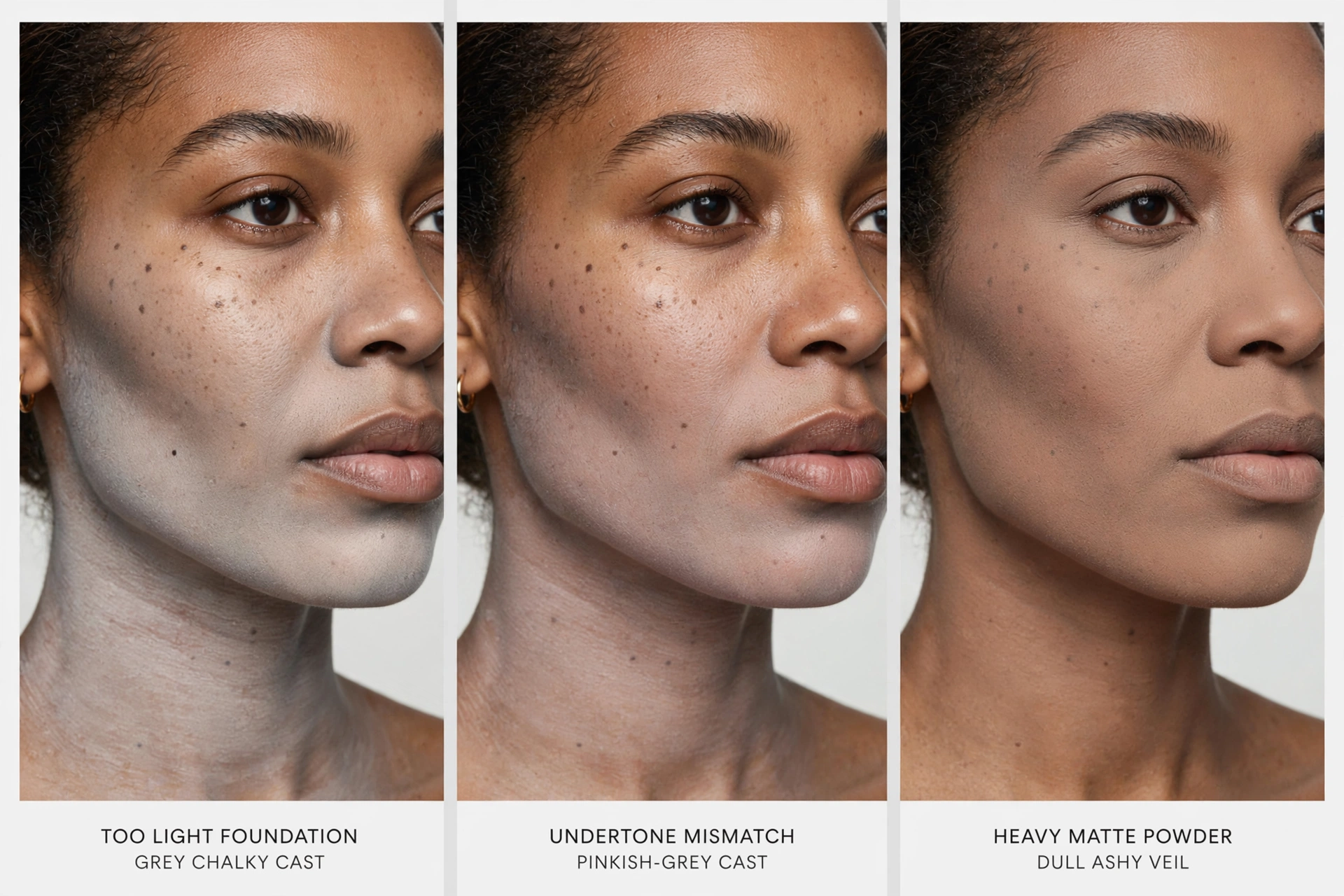
Axis 1: Shade depth mismatch — the too-light grey cast
This is the simplest and most common cause, and it works differently than most people imagine. A foundation that is too light doesn’t just look “lighter” — it can actively read grey, especially on medium, tan, and deeper skin.
Why: skin has depth — natural shadowing, variation, and a richness that comes from melanin. When you cover that with a pigment mixture that’s lighter than the skin, you’re replacing complex, dimensional color with a flatter, more opaque layer of lighter pigment. The result isn’t a lighter version of you; it’s a desaturated veil. The grey comes from the loss of depth and color complexity, not from anything chemically wrong.
The telltale signs:
- The grey is there from the first application — nothing changed over the day.
- There’s visible contrast at the neck and chest: the face is a different depth than the body, and the contrast itself reads grey.
- It looks worse in natural daylight than in a dim bathroom mirror (more on that in Axis 5).
- Your bare skin has strong depth and color variation that the foundation is erasing.
This can happen on any skin tone, but it is especially pronounced on deeper skin, where the gap between natural melanin richness and a too-light pigment load is widest — and where “close enough” shades skew grey fastest. This is central, not a niche exception.
What this is not: this is a depth problem. Adding warmth to a too-light shade (going warmer at the same depth) does not fix it — it changes the undertone of the veil without restoring the missing depth.
Axis 2: Undertone mismatch — the wrong color family entirely
Undertone is the second dimension of shade: not how light or dark, but what kind of color the pigment carries. Getting the depth right and the undertone wrong is one of the most frustrating ways to get a grey cast, because the shade looks plausible in the bottle and even on a hand swatch.
The mismatch patterns that read grey:
- Too pink or red on skin with golden or olive warmth: the pink reads against the skin’s yellow-green as chalky, desaturated, or “off” — often perceived as grey rather than pink, because the eye averages the conflict.
- Too yellow or golden on skin with cool or neutral-pink tone: reads as jaundiced at first glance, and in many lights the flatness of it registers as dull or ashy.
- Too peach: peach is a common compromise pigment that sits between pink and gold. On skin that is neither — particularly on muted or olive skin — peach can read as muddy — or simply too grey for the skin wearing it.
- Insufficient olive/green balance: skin with olive undertones carries a greenish-neutral cast that most foundation ranges under-serve. When the available “neutral” is really pink-neutral or beige-neutral, it sits on top of olive skin rather than blending into it — and that layered mismatch reads grey or dull.
- Muted vs. saturated: some skin reads warm but muted (soft, desaturated warmth); some reads warm and saturated (rich, high-chroma warmth). A shade can be the right depth and even the right undertone family but too saturated (too vivid) or too muted for your skin — and that mismatch in intensity registers as grey or artificial.
Notice what this section does not do: it does not sort you into “warm” or “cool” and hand you a rule. Crude warm/cool stereotypes are exactly what produce the undertone mismatches that cause ashiness — they flatten real skin into two buckets. There are also no universal rules here about who “should” wear olive tones; olive undertone appears across the full range of skin depths, and the question is always whether your skin reads that way, not whether your skin-depth category does.
What this is not: this is not a depth problem. Going darker or lighter at the same wrong undertone doesn’t fix it — and going darker while keeping the wrong undertone is how grey becomes grey-orange.
Axis 3: Excessive or opaque coverage behavior
Here’s a mechanism almost no one talks about: the more coverage a formula gives, the more any shade mismatch shows. This isn’t because full coverage “causes” ashiness — it doesn’t. It’s because an opaque layer replaces more of your skin’s visible tone, so the match has to be better. A slightly-too-light or slightly-off-undertone shade in a sheer formula may read perfectly natural, because your actual skin color shows through and does most of the work. The same shade in a full-coverage formula can read distinctly grey.
Think of it this way: sheer coverage is your skin plus a tint of adjustment. Full coverage is the foundation’s pigment, almost entirely. At full opacity, the pigment mixture in the bottle is doing all the color work — and no mass-produced pigment blend matches every real human face exactly. The gaps become visible, and “gap” reads as grey, flat, or mask-like.
This explains a common and confusing experience: you find a shade that looks right as a tinted moisturizer or a light application, buy the same shade in the line’s high-coverage formula (or simply apply more of it for a special event), and it suddenly reads ashy. The shade didn’t change. The amount of your skin showing through did.
The telltale signs:
- Sheer applications of the shade look fine; heavier applications of the same shade look grey.
- The grey is worst in the center of the face where product builds up, and fades toward the edges where it’s blended thin.
- The same shade in a sheerer formula reads fine.
What to get right: opacity is an amplifier of the other axes, not a standalone cause. Sheering out a badly mismatched shade helps, but it helps by letting your skin rescue the color — the mismatch is still there underneath.
Axis 4: Finish, powder, and light-scattering effects
There is an important fork in the road here: was the foundation already grey before you set it, or was it fine until you added powder?
If it was already grey, powder isn’t your problem — go back to Axes 1–3. But if the base looked correct and the grey arrived with the setting powder (or with a matte finish layer), you’re dealing with surface optics.
Powder sits on top of the skin as fine particles. Those particles scatter light — they bounce light in many directions instead of letting it pass through to the skin and reflect back. The result is a flatter, more matte, slightly paler read. A little of this is the whole point of powder (shine control, blurring). Too much — or a powder that’s too light, too opaque, or applied too heavily — and the scatter veils the foundation’s color, reading as dull, chalky, or grey.
The variables that matter, each independently:
- Powder shade: a translucent powder with a white or very light base can shift any foundation lighter and greyer. A tinted powder that’s the wrong undertone for you does the same at higher intensity.
- Amount: dusting vs. baking vs. full-face heavy application — more powder means more scatter.
- Opacity: a powder with actual pigment coverage (a powder foundation used as setting powder) behaves differently from a truly translucent one.
- Mattifying effect: matte surfaces scatter more light than satin or dewy surfaces. A matte primer or matte setting spray can add to the flattening.
The chalky-texture edge case: if the powder is also making the skin look dry, rough, or textured — not just grey — that’s the overlap with the cakey guide. The texture failure is theirs; the color-veil failure is this article’s. Read the powder row of the diagnosis matrix in Section 7 for the combined handling.
Axis 5: Lighting and context effects
This is the axis people skip, and it ruins more diagnoses than any other. Lighting changes how color is perceived without anything chemically changing. A shade match that looks perfect under warm bathroom lighting can read noticeably grey under cool office fluorescents or in a car window’s daylight. Neither lighting is lying; color perception is relative to the light source and the surroundings.
The practical implications:
- Test shade in indirect natural daylight. Not direct sun (which is harsh and washes detail out), not dim warm bathroom light (which flatters and hides mismatch), but soft daylight — facing a window, outdoors in shade, the classic “step outside and look in a mirror” check. This is the most neutral reference most people have access to.
- Check more than one light. A match that only holds in one lighting condition isn’t a reliable match. Check daylight, your normal indoor light, and the lighting you’ll actually be seen in (office, evenings).
- Flash photography is a separate case. If the face looks normal in person and white or ghostly mainly in flash photos, that’s flashback — Article #2 — not an undertone problem. Don’t change your shade based on flash photos.
- Surroundings matter. Skin looks different against a bright white shirt than a dark one; neckline color changes perceived face color. When comparing shades, keep the surroundings consistent.
No unsupported color-temperature claims are needed here: the point is simply that human color perception is context-dependent, and a diagnosis made under one light is a guess. One rule of thumb from professional practice: if the grey appears only under a single light source and vanishes everywhere else, investigate the light before you investigate your foundation.
When it appears tells you which one
This is the fastest way to narrow the field. Most people can place themselves in one row just by remembering when the grey shows up.
Grey immediately after application → investigate depth (Axis 1), undertone (Axis 2), or opacity (Axis 3). The color was wrong before anything else touched it. Nothing changed over time, no powder added yet, no special lighting. Go straight to the stripe test in Section 5.
Fine until you add powder, then dull or grey → investigate powder shade, amount, and finish (Axis 4). The base wasn’t the problem; the layer on top of it is. Test by blotting or lightly wiping one cheek of powder and comparing — if the grey lifts with the powder, you’ve found it.
Fine in daylight, white or ghostly in flash photos → that’s not ashiness, that’s flashback. Don’t change your shade based on it; see Article #2 for the actual diagnosis (mineral UV filters and light response).
Correct when applied, darker or oranger hours later → that’s not ashiness either, that’s color change over wear. Grey-from-the-start belongs here; greying-or-darkening-by-midday belongs to Article #4.
Grey only under one particular light (e.g., office fluorescents) → investigate lighting and context first (Axis 5) before touching the product at all. If the match looks right in daylight, your normal indoor light, and your car mirror but wrong under the office tubes, the foundation is probably fine.

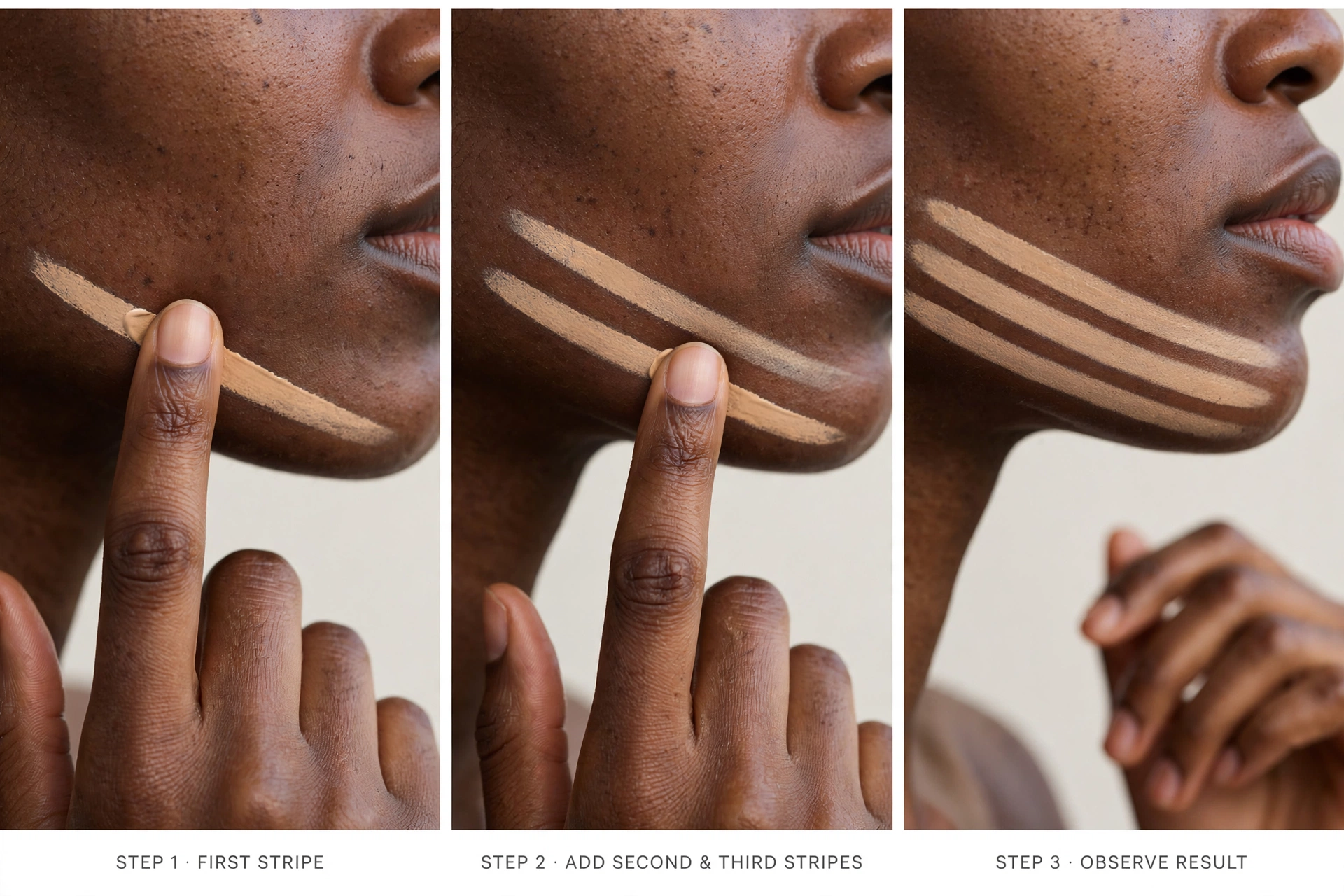
The stripe test: find your axis in about two minutes
Comparing shades side by side on your actual face is the only reliable way to separate a depth problem from an undertone problem — and it’s much more informative than a hand or wrist swatch, because the skin on your inner wrist doesn’t match your face. This is a practitioner’s method, not lab science: it won’t produce numbers, and it won’t tell you what to buy. But it’s the method professionals actually use — Bobbi Brown advises trying foundation on the cheek and forehead and choosing the shade that “disappears,” with daylight as the truest test light; makeup artist Rea Ann Silva recommends walking into natural daylight to see which swatch blends most naturally. What the test tells you is which axis is failing, which is exactly the information you need before making any change.
How to run it:
- Pick three stripes. One of your current foundation (or your best current guess), one a nearby depth alternative (one step deeper if your current shade reads too light, or lighter if it reads too dark), and one a nearby undertone alternative (the same depth, different undertone family). If you only own two foundations, do two stripes — even two are more informative than guessing.
- Place them as narrow stripes along the jawline, running from cheek down toward the neck — this is where a match either merges naturally or shows its failure. Use equal amounts of product, the same application method, on the same patch of skin.
- Minimize surrounding makeup on the test area so you’re reading the stripes, not your blush or bronzer.
- Keep everything else constant: same lighting (indirect natural daylight — face a window), same skin prep, same observation moment.
- Read the result: which stripe disappears most naturally into the face-to-neck transition?
Reading the outcome:
- The depth alternative merges best → you have a depth problem (Axis 1). Your undertone was fine; you were simply wearing too much or too little pigment for your skin’s natural depth.
- The undertone alternative merges best → you have an undertone problem (Axis 2). Your depth was close; the color family was fighting your skin.
- Neither merges — all stripes read grey, or each reads wrong in a different way → you may have both problems at once, or the issue may be opacity/finish (Axes 3–4). Try a sheerer application of your best stripe as a follow-up: if it suddenly merges, opacity was amplifying a small mismatch.
A note on dry-down timing: foundations can shift slightly as they dry — solvents evaporate, pigment settles, the film’s finish develops. There is no universal waiting time, and brand-to-brand behavior differs. The point is consistency: whatever timing you use (immediately, a few minutes later), keep it the same across all stripes, and observe them at the same moment under the same light. Comparing stripe A at minute one to stripe B at minute twenty isn’t a comparison.
This test is a shopping and troubleshooting method, not experimental proof. Its value is that it replaces five competing guesses with one observation. Most people who run it realize their “ashy foundation” problem was actually a depth problem — or that it was an undertone problem they’d been trying to fix by going darker, which is exactly how grey becomes grey-orange.
What the pigment science actually says
Evidence sidebar — read this at the correct tier. What follows is real cosmetic-science research, but it answers a formulation question, not your consumer question. Direct, controlled research on “why does my foundation look ashy on my face” as a consumer phenomenon is sparse — and you deserve to know that instead of being told otherwise. This research is useful because it explains mechanisms (why grey casts happen at all in pigment mixtures), which is what makes the five axes above more than opinion. It does not tell you which shade to buy.
The key work here comes from Dr. Gabriella Baki, an associate professor of pharmaceutics and director of the undergraduate Cosmetic Science and Formulation Design program at the University of Toledo. Her team investigated why foundations so often produce a grey cast on deeper skin, and presented the findings as “Effect of ultramarine blue on the color of powder and stick foundations” at the American Chemical Society’s spring 2025 meeting in San Diego on March 26, 2025. Present this honestly: this is conference research, not a peer-reviewed journal paper — the ACS itself asks journalists to report that the research “was presented at a meeting of the American Chemical Society,” and no peer-reviewed publication of this work existed at the time of writing. The team formulated 20 loose-powder and 18 stick foundations in darker and lighter shades, varying the ratio of black iron oxide to ultramarine blue and the white pigment used. They measured color with a Konica Minolta CM5 spectrophotometer, evaluated press-downs on Leneta paper, and ran a small IRB-approved skin study. This is relevant to how foundations are formulated — not a consumer study of “ashy foundation” on real faces, and not a test of any commercial product (liquids were explicitly named as future work).
What they found — and what it means, by evidence tier:
Established evidence (from the research and independent corroboration):
- The grey cast on darker skin was linked to the pigments typically used to darken foundations: in larger quantities, black iron oxide-based darkening mixtures produced grey rather than natural brown.
- Ultramarine blue — a different dark pigment — produced redder, yellower hues and reduced the grey cast, across both darker and lighter foundations.
- Part of the mechanism is optical: ultramarine blue is inherently less opaque than black iron oxide (independently confirmed in laboratory testing), and creates a less opaque color — less opacity means less of the flat grey veil.
- The white pigments matter too: the team’s abstract notes that titanium dioxide and zinc oxide “can also contribute to this phenomenon,” while zinc oxide specifically reduced white cast and created warmer hues in an ultramarine-blue base.
- The team’s recommendation was a combination — black iron oxide plus ultramarine blue — not blue alone; blue by itself was insufficient for the very darkest shades. The formulas were intended as an industry “backbone,” not commercial products.
- Independent corroboration exists: a peer-reviewed 2023 study by L’Oréal R&I color scientists in the International Journal of Cosmetic Science confirmed that ultramarine blue increases reflection of red light and improves perceived skin homogeneity — so the pigment mechanism itself is established even though this particular study is preliminary conference work.
Formulation principle (standard cosmetic science, qualitative):
- Foundation color is a mixture of pigments — iron oxides (black, red, yellow) plus others. Grey casts arise when the mixture, at the opacity needed for coverage, doesn’t reproduce the warmth and variation of real skin. More pigment (for deeper shades or higher coverage) amplifies any mismatch in the mixture.
- Opacity and light interaction are inseparable: an opaque film reflects its own color; a less opaque film lets the skin’s tone participate. This is the physical basis of Axis 3 above.
Professional practice (practitioner convention, not lab science):
- The jawline stripe comparison is the standard method makeup artists use to judge matches — because color is comparative, not absolute.
- Depth and undertone are judged separately in professional color matching; one never substitutes for the other.
Practical inference (synthesis, labeled as such):
- Why do so many foundations read grey on deeper skin specifically? The reported mechanism — iron-oxide-heavy darkening mixtures at high pigment loads — lines up with the consumer experience: the deeper the shade needs to go, the more dark pigment it needs, and the more room there is for the mixture to drift grey instead of rich. This is a plausible mechanism, not a proof that your specific product uses that mixture.
- Why can sheering out help? If opacity is what makes the mismatch visible (established above), then reducing opacity is a legitimate diagnostic move — not “cheating,” but removing the amplifier.
What is NOT supported — claims you will not find here:
- There is no evidence that “skin pH” or “acidic skin” causes grey foundation. Iron oxides are relatively stable under ordinary user conditions, and the only documented pH-driven shift in cosmetic pigments is black iron oxide turning red below pH 5.5 — not grey. (Cosmetic chemist Valerie George, writing in the industry trade publication HAPPI, explicitly corrects the online perception that pH drift or oxidation drives foundation color change.)
- There is no evidence that “oxidation causes every shade change.” Oxidation-adjacent changes exist as a wear phenomenon — see Article #4 — but they go darker and warmer, not grey: the documented mechanism is red iron oxides wetting out over time and interacting with sebum. Grey-from-the-first-stripe is a pigment-formulation issue, not a chemistry reaction on your face.
- There is no single pigment universally responsible for all ashiness. Black iron oxide is relevant to the formulation story above — and the same research program notes blue pigments were historically avoided because their sulfur can form hydrogen sulfide gas at low pH, which is why formulators leaned on black pigment in the first place — but no one pigment explains every grey cast.
- There are no universal olive-undertone rules (see the next-but-one section).
If direct research on the consumer experience of ashy foundation is thin, the honesty of saying so is itself the point: you’re better served by mechanisms you can test at home (the stripe test) than by certainty nobody has earned.
What to change, per diagnosis
Once you’ve identified your axis, change only what the diagnosis points to. Each row includes what not to do, because the standard “fixes” for ashiness — darker, warmer, more product — are exactly how one problem becomes two.
| What you see | When it appears | Likely cause | What to test | What to change | What NOT to do |
|---|---|---|---|---|---|
| Grey cast immediately; visible face–neck/chest contrast; worse in daylight | At application, from the first stripe | Depth mismatch — shade too light | Stripe test with one-step-deeper alternative; check face vs neck in daylight | Move to a deeper shade at the same undertone | Don’t fix depth with warmth (going warmer at the same depth just changes the veil’s tint); don’t add bronzer over the whole face as a depth fix — it shifts undertone, not depth |
| Depth seems right but shade reads pinkish, muddy, or oddly flat-grey | At application | Undertone mismatch | Stripe test with same-depth, different-undertone alternatives; observe in daylight | Shift undertone family (e.g., pink-neutral → golden/olive) at the same depth | Don’t go darker to “warm it up” — darker + wrong undertone = grey-orange; don’t assume warm/cool buckets apply to you |
| Shade fine sheer, grey when built up; worst in product-heavy zones | When coverage increases | Opacity amplifying a small mismatch | Sheer out your best stripe; compare same shade sheer vs full | Use less product, a sheerer formula, or spot-conceal instead of full-face full coverage | Don’t assume full coverage caused it — the mismatch was always there; don’t keep the same heavy application and just change the shade |
| Base looked fine, grey arrives after setting | After powder | Powder shade/amount/opacity | Wipe or blot powder off one area; compare powder vs no-powder halves | Less powder; a powder closer to your tone; a truly translucent (non-pigmented) powder; lighter application | Don’t pile on more powder to “set” the grey away; don’t switch to a much darker powder — it won’t fix the underlying scatter pattern, and a chalky dry texture means reading the cakey guide too |
| Looks fine in person, white/ghostly in flash photos | In photos, mainly flash | Flashback, not ashiness | Compare mirror vs flash photo | Nothing about shade — see Article #2 | Don’t buy a darker shade to fix a camera problem |
| Correct at application, darker/oranger hours later | Over the day | Color change over wear | Check same shade at hour 0 vs hour 6 | See Article #4 for the wear diagnosis | Don’t confuse midday darkening with the grey-from-the-start problem this article covers |
| Grey only under one specific light (e.g., office fluorescents) | Only in that light | Lighting/context | Compare daylight, home light, and that light with the same application | Change where you check your match, not the match itself; verify in the light you’ll actually be seen in | Don’t rebuy your whole routine based on one bad light |
If your result sits between rows — depth is a little off and the undertone is a little off — fix the bigger one first. A stripe test where two different stripes each partially merge is telling you the match needs movement on both axes, and changing both at once (darker and different undertone) is guesswork. Move one axis, retest, then move the other if needed.
The olive-undertone case: why the right depth can still look grey
This section exists because it’s one of the most common unanswered questions in the wild — and because the standard undertone advice (“just go warm” / “just go neutral”) consistently fails these readers.
Olive undertone means the skin carries a greenish-neutral cast — sometimes obvious, sometimes only visible as a certain muted flatness in how colors sit on it. Professional guidance describes olive as essentially a neutral undertone where a cool component (blue) and a warm component (yellow) combine into green — and Healthline’s editorial guidance is blunt that it’s usually a mistake to reach for a warm (yellow) foundation on olive skin. It appears across the full depth range, from fair to very deep, and it complicates matching because most shade ranges are built around pink-to-golden axes. The available “neutrals” are often pink-neutral or beige-neutral — compromises that work for many faces but not for olive ones.
Why olive skin so often reads grey in the “wrong” foundation:
- Pink-based neutrals clash with green cast. A pink-neutral foundation on olive skin doesn’t average into harmony; it layers a cool-pink film over a green-neutral base, and the visual conflict registers as grey, chalky, or “off” rather than pink. The shade can be exactly your depth and still fail.
- “Warm” isn’t the fix either. Golden or yellow foundations on muted olive skin can read too vivid — the right family, wrong saturation — and in some lights that mismatch reads dull or ashy too. This is the muted-vs-saturated axis from Section 3: olive skin often needs muted color, and many warm foundations are high-chroma.
- The grey-pink-orange merry-go-round. This is the signature olive-undertone experience: the pink shade reads grey, so you try the warm one, which reads orange, so you try the neutral, which reads pink-grey again. Each attempt moves one axis while the real need — a muted, green-balanced match — sits off the grid of what’s available. The merry-go-round isn’t user error; it’s a range-design gap.
What to do, practically, staying inside what evidence supports:
- Stop assuming the warm/cool binary has an answer for you. It’s the binary that’s incomplete, not your skin.
- Test muted against saturated. If warm foundations read orange, the problem may be saturation, not warmth. Compare a muted warm option against a vivid warm one at the same depth — this is the stripe test’s job, one axis at a time.
- Don’t invent certainty about “olive” products. Some brands now label olive shades; where genuinely olive-balanced options exist, they’re worth testing — but a label is a marketing claim, not a guarantee of your match. Test every candidate the same way: stripes, daylight, one variable.
- Consider that partial grey may be a range problem, not a you problem. If no single shade merges and the mismatch is small, sheerer application (Axis 3) lets your actual skin tone do more of the color work — which is a legitimate strategy, not a compromise.
Honesty boundary: there is no universal olive rule — not “all olive skin needs green,” not “olive is always warm-neutral,” not depth-based prescriptions. Olive is a family of skin presentations with shared patterns, and the patterns above are practical inferences from those patterns plus color logic, not color-science certainties. Anyone selling you certainty here is selling you something.
FAQ
Why does my foundation look ashy even though the shade seems to match in the bottle?
Bottle color is judged in glass, under store lighting, at high pigment concentration — none of which is how it looks sheered onto skin in daylight. The stripe test exists precisely because in-bottle judgment fails: place stripes on your jawline, check in indirect natural daylight, and judge which one disappears. Almost every “matched in the bottle but grey on the face” case resolves to a depth or undertone axis once tested this way (Sections 3 and 5).
Why does my foundation look grey on dark skin?
Deeper skin has strong natural depth and color variation. A shade that’s too light replaces that complexity with a flatter, more opaque layer of lighter pigment — and the loss of depth reads as grey. Additionally, formulation research from the University of Toledo found that the pigment mixtures used to darken foundations (typically heavy on black iron oxide) tend to produce grey rather than natural brown at high pigment loads. This doesn’t mean every product has this formulation issue, but it explains why the grey-cast complaint concentrates on deeper shades: more dark pigment means more room for the mixture to drift grey.
My foundation looks fine at home but ashy at work — is my shade wrong?
Probably not. If the grey appears under one light source and vanishes everywhere else, the light is the variable — check Section 4’s lighting row and Axis 5. Judge your match in indirect natural daylight and in the lighting you’ll actually be seen in, before changing any product.
Why does my foundation look ashy after powder but not before?
Because powder is an independent optical layer: its fine particles scatter light and veil the foundation’s color underneath. Test it by removing powder from one area and comparing halves. The fix is in the powder, not the foundation — less of it, a shade closer to your tone, or a truly translucent non-pigmented option (Section 4, Axis 4, and the matrix).
Can full-coverage foundation cause ashiness?
Not exactly — and the distinction matters. Full coverage doesn’t create a grey cast out of a good match; it reveals an imperfect match by removing your skin from the color equation. The same shade that’s natural as a tint can read grey at full opacity because the foundation’s pigment is now doing all the color work. If your shade reads grey only at higher coverage, the shade has a small mismatch — sheering out is a legitimate fix, not a compromise (Axis 3).
Why does my foundation look dull but not exactly grey?
“Dull” is often the same phenomenon at lower intensity — or it sits at the intersection of color and finish. If the base is a good match but the face looks flat, suspect the finish axis: matte powders and mattifying layers scatter light and kill dimension. If the dullness has a grey cast, run the stripe test — depth or undertone is the likely axis. And if the dullness is about texture (dry, rough, product sitting visibly), that’s the cakey guide’s territory.
Is grey foundation the same as oxidation?
No — and confusing the two leads to wrong fixes. Grey from the first stripe is a color-design problem (depth, undertone, opacity, finish, lighting). A shade that’s correct at application and turns darker or oranger over hours is a wear-change phenomenon — the subject of Article #4. There is no good evidence that “oxidation” — or skin pH, or acidic skin — causes grey-from-the-start.
My foundation looks grey and I have olive undertones — what shade family should I choose?
Don’t start from a shade family — start from the stripe test. Olive undertone breaks the warm/cool binary: pink-neutrals can read grey on olive skin, and vivid warm shades can read orange. Compare candidates one axis at a time (depth first, then undertone, then muted-vs-saturated), in daylight, on your jawline. Where genuinely olive-balanced shades exist in a range they’re worth testing, but test every label the same way — the label is marketing, not a match guarantee. See the full worked case in Section 8.
Sources
Evidence tiers are labeled deliberately — they are part of the article’s honesty, not decoration.
- ACS Headline Science, “Making makeup better with blue.” The American Chemical Society’s page for the presentation “Effect of ultramarine blue on the color of powder and stick foundations” by Dr. Gabriella Baki (University of Toledo), presented at ACS Spring 2025, March 26, 2025. Key context: blue pigments were historically avoided because ultramarine blue’s sulfur can form hydrogen sulfide at low pH, so formulators relied on black pigments for darker shades — and too much black pigment can wind up looking grey. Read it. (Conference research reported by the presenting scientific society — NOT peer-reviewed.)
- Newswise / ACS press release, “Blue Pigment Improves Foundation Makeup Shades for Dark Skin” (March 26, 2025). Carries the full abstract: 20 loose-powder + 18 stick foundations, black-iron-oxide/ultramarine-blue ratios varied, Konica Minolta CM5 spectrophotometer, press-downs on Leneta paper, small IRB-approved skin study; white pigments (titanium dioxide, zinc oxide) can also contribute to the grey phenomenon, while zinc oxide reduced white cast in an ultramarine-blue base; recommendation is combining black iron oxide with ultramarine blue. Read it. (Conference abstract — NOT peer-reviewed.)
- Ikkai, Blaksley, Hayashi & Jaspers (2023), “Cosmetic effects of red-light reflection by ultramarine blue pigment,” International Journal of Cosmetic Science, 45(3), 413–423. Peer-reviewed study by L’Oréal R&I color scientists: foundations using ultramarine blue instead of black pigment produce an optical effect that makes facial skin look better — via increased reflection of red light — confirmed by spectroscopic measurement and expert visual evaluation. Read it. (Peer-reviewed — the pigment mechanism itself is established science.)
- Ikkai et al., “Red-light reflection of ultramarine blue: impact on skin-enhancing effect when used in cosmetics,” 34th IFSCC Congress, Brazil, Oct 2024 (full congress paper, hosted by L’Oréal). Industry technical literature: ultramarine blue is inherently less opaque than iron-oxide pigments, and adding it to the conventional inorganic-pigment mix “effectively prevented the foundation from exhibiting a grayish appearance in individuals with deeper tones.” Read it. (Industry-authored congress paper — disclosed as L’Oréal R&I technical literature.)
- HAPPI, “Dear Valerie: Avoiding Foundation Color Change” (cosmetic chemist Valerie George). Formulation column correcting the online perception: iron oxides are relatively stable under ordinary user conditions, most formulas sit in a pH range that avoids pH-caused drift (the only documented shift is black iron oxide turning red below pH 5.5 — not grey); real color change over wear comes from red iron oxides wetting out and interacting with sebum, shifting darker/warmer. Read it. (Practicing cosmetic chemist, industry trade publication.)
- Marie Claire UK, “A complete guide on how to find your foundation shade” (expert-sourced). Professional practice: Bobbi Brown — try foundation on the cheek and forehead, “if it disappears, then it’s the right colour,” and daylight is the truest test light; Dior pro makeup artist Jamie Coombes — match the jawline to the décolleté/body and test on bare skin. Read it. (Professional practice, beauty editorial.)
- Marie Claire, “Mineral Sunscreens Are Hard to Formulate…” (expert-sourced). Cosmetic chemists Shuting Hu, PhD and Julian Sass, PhD explain the physics: zinc oxide and titanium dioxide have a high refractive index and scatter visible light, “which our eyes perceive as white or ‘ashy'”; to tint mineral formulas for darker skin, formulators must add more pigment — “the darker the skin tone… the more pigments you have to use.” Read it. (Formulation physics via expert-sourced editorial.)
- Adore Beauty, “How Do Makeup Artists Prevent Flashback?” (beauty-education editorial). Used only for the Article #2 boundary: flashback is a white cast that appears in photos — intense flash light deflected off the skin into the camera lens — distinct from true grey cast from pigment undertone balance. Read it. (Retailer beauty editorial — professional practice, not science.)
- Refinery29 (UK), “How To Find Your Skin’s Undertones & Get It Right” (MUA and product-developer interviews). Professional practice: olive skin “typically has a neutral undertone, because olive is a combination of a cool tone (blue) and a warm tone (yellow), which makes, well, green”; matching undertone matters more than matching depth; the four basic adjusting pigments are white, black, red, and yellow, with blue and green increasingly added. Read it. (Professional practice.)
- Healthline, “How To Find Your Skin’s Undertones, Foundation Match, Color Palette.” Reputable health editorial: olive is “a combination of undertones” with a unique green component; for olive undertones “it’s usually a mistake to go for a warm (yellow) foundation” — and honestly notes that “it may still take some trial and error.” Read it. (Editorial guidance, not science.)
- indy100, “Why foundations may look ashy or grey on scientists” (~Apr 2025). News write-up of the Baki/UToledo research; corroborates the presentation details in sources 1–2. Read it. (Secondary news — cited only as corroboration, not as the science itself.)
The limitation, restated. Direct, controlled research on “why does my foundation look ashy on my face” as a consumer phenomenon is sparse. The strongest work available is formulation research: one conference presentation (sources 1–2), one peer-reviewed pigment-optics study (source 3), and industry technical literature (sources 4–5). Everything the article says about pigments is bounded by what those sources actually tested; everything about testing shades at home is professional practice, labeled as such.
4 thoughts on “Why Does My Foundation Look Ashy or Grey? How to Tell What’s Really Causing It”
Comments are closed.